

And we don't even understand it
Roger Pielke Jr., Jun 16, 2025
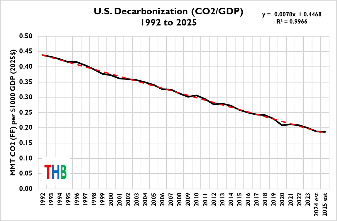
You’d be hard pressed to find a more fascinating straight line. The figure below is one of the most amazing graphs in all of climate policy.¹ It shows the decarbonization of the U.S. economy from 1992 to 2025² — with decarbonization is defined as the ratio of carbon dioxide emissions (from fossil fuels) to GDP (in 2025$).
I was motivated to update this time series after reading the best analysis of recent U.S. climate policy that I’ve seen, by Ted Nordhaus of The Breakthrough Institute. Ted’s entire, detailed analysis is well worth your time, but the part that sent me off making graphs was this:
The wild swings of energy policies from Democratic to Republican administrations beg the question of whether the United States is capable of sustaining any coherent energy policy, whether in service of climate mitigation or energy dominance. And yet, despite all of that political and policy volatility, the US over recent decades has both managed to sustain a significant and consistent rate of decarbonization while establishing its energy economy as the envy of much of the world.
What makes the U.S. decarbonization rate remarkable is that it is (a) not an explicit focus as a policy metric, (b) few people pay attention to it (you’ll see decarbonization discussed more here at THB than most anywhere), and, (c) U.S. politics and energy policy has indeed been subject to “wild swings” over the past 30+ years. And yet, with all that, the linear decline.
Consider another remarkable graph. The figure below shows, for 1992 to 2025, a scatterplot of U.S. GDP versus U.S. carbon dioxide emissions from fossil fuels.
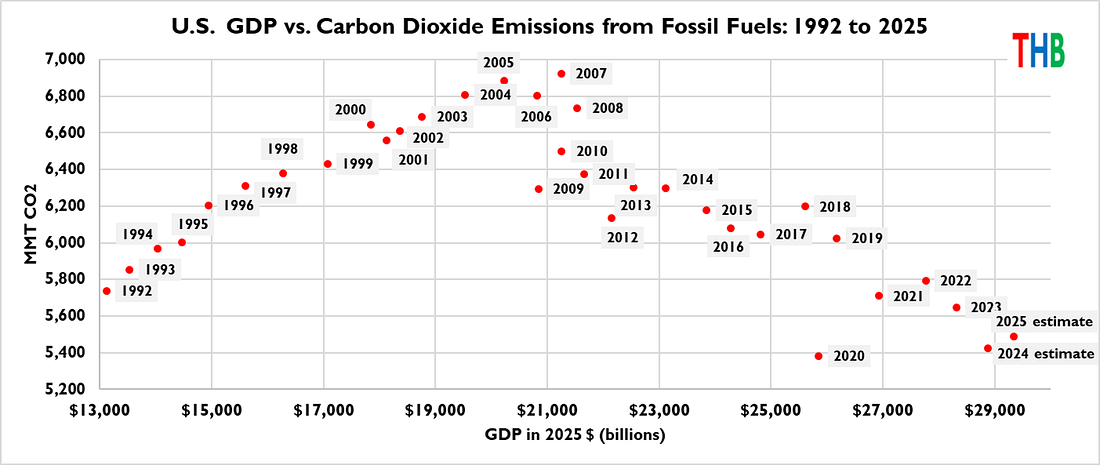
The graph shows that from 1992 to 2005, increasing GDP was fairly tightly coupled to increasing emissions of carbon dioxide. Then, in about 2006, things changed — since then, GDP has been decoupled from emissions of carbon dioxide — GDP has continued to increase as emissions fall.
Decarbonization results from the net effects of decreasing carbon intensity of energy consumption and/or decreasing energy intensity of the economy. We can make some sense of causality with the figure below, which shows from 2006 the change in U.S. consumption of coal, natural gas, and renewables.³
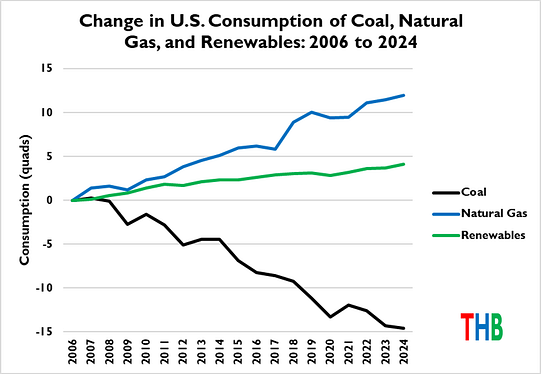
The figure shows that from 2006 to 2024, coal consumption decreased rapidly, and by slightly less than the combined increase in natural gas and renewables. Natural gas consumption increased dramatically due largely to technologies such as fracking and horizontal drilling, along with learning through implementation by the private sector. Because natural gas has about half the carbon intensity of coal, and renewables much less, these consumption trends contributed to emissions going down even as economic activity increased by about 25% (after inflation).
How long can decarbonization continue based on replacing coal with less carbon intensive generation? The figure below gives us a sense of the answer.

The figure shows that the decline of coal has been just about linear since about 2006. If that trend were to continue, then the U.S. would be coal-free by the early 2030s, suggesting that the linear rate of U.S. decarbonization could continue for the rest of the decade without a significant departure from recent energy trends.
However, at some point the decline of coal will stop — either because the U.S. has exited coal or the decreasing trend in coal consumption of the past decade is stopped or reversed. At that point, if the decades-long systematic decarbonization of the U.S. economy is to continue, then some other dynamic will have to kick in.
Some concluding thoughts:
- We do not fully understand the linear rate of decarbonization over the past three decades — What dynamics have modulated this trend such that it has been so consistent?
- If we understood that trend better, we’d be better positioned to understand what it would take to keep it going;
- If we kept that decarbonization trend going, the U.S. would hit “net zero” carbon dioxide emissions in the middle of the second half of the century, approximately consistent with the Paris Agreement’s 2 degrees Celsius temperature target;⁴
- Climate policy focused on deep decarbonization does not have to characterize energy policy through the rest of the century — it needs instead to focus primarily on how to maintain, if not accelerate, rates of decarbonization of recent decades for the next few decades;
- The U.S. case shows that technological advancement is essential for maintaining historical rates of decarbonization;
- So long as coal is on the grid, natural gas is a bridge fuel — Expanded nuclear electricity generation would seem to be a no-brainer, for many reasons, and may in future decades contribute to greater decarbonization;
- The U.S. natural gas boom starting in the 2000s resulted from decisions made in the public and private sectors (and in collaboration) since the 1970s. Energy policy outcomes do not conform to electoral calendars;
- A question that should be asked: Has U.S. climate policy since 1992 even mattered for decarbonization? Or have steps that result in maintaining historical rates of decarbonization been recharacterized as climate policy?
A focus on decarbonization has another benefit — pretty much everyone values economic growth, emissions reductions, or both. Based on the historical data, I’d hypothesize that economic growth and decarbonization are actually inter-related, and mutually reinforcing.
We should be paying more attention to the dynamics of decarbonization.
1
Global decarbonization has followed a similar linear trend and is also incredibly fascinating.
2
Note that 2024 and 2025 GDP values are estimates. The Trump Administration has yet to publish updated historical budget tables with the president’s budget, so I am using numbers from 2024. Any revisions to last year’s numbers won’t make much difference for this analysis. Also, I started the analysis in 1992 because that is the year of the Rio Climate Conference.
3
Renewables are defined by EIA as: hydro, geothermal, solar, wind, and biomass. I generally do not like the concept of “renewables,” preferring the notion of carbon-free generation, but I am using EIA terminology here.
4
The same is true at the global scale.